
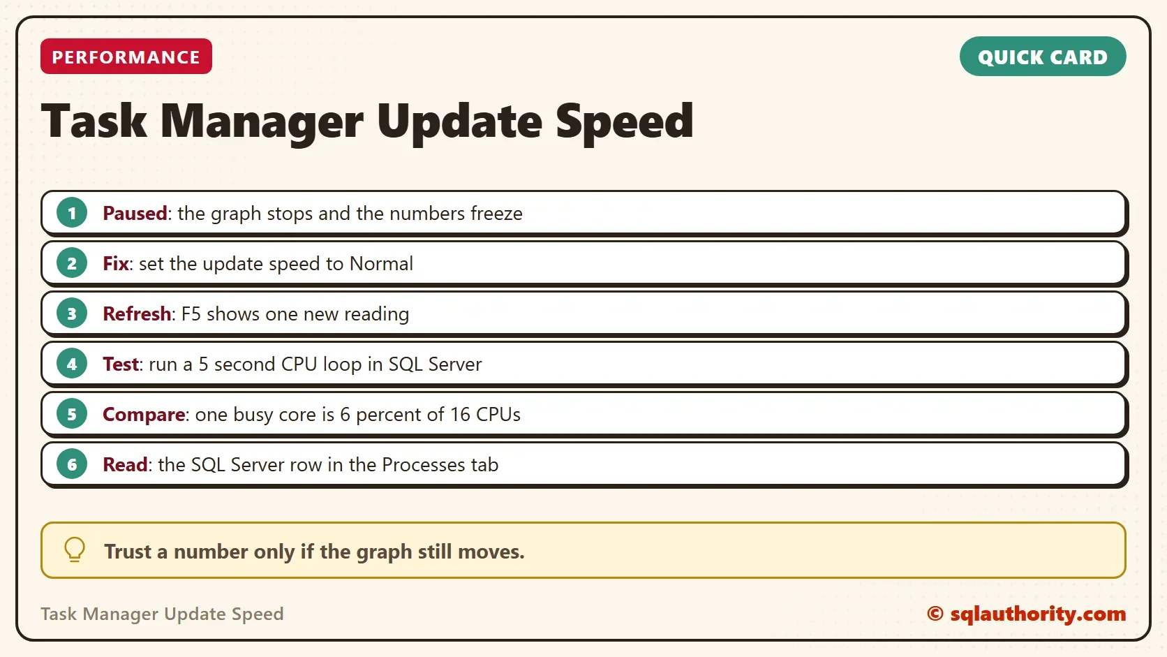
The Task Manager update speed sets how fast the CPU graph moves. A paused graph can look like a CPU problem. The server is fine, and the picture is old.

A Spike That Never Changes
A DBA sent a Task Manager screenshot to a consultant. It showed a constant spike of CPU, and the shape repeated itself. The server showed no slowdown. The team worried that the machine was hacked or running malicious code.
The consultant joined a call and watched the screen. The numbers did not change at all. Someone had set the Task Manager update speed to Paused, so the graph showed a frozen moment. Once the speed went back to normal, the CPU looked normal too.
How a Paused Graph Looks
A live CPU graph scrolls. A new reading appears every second or so, and the line moves. A paused graph stops. The percentages freeze, the line stops scrolling, and a screenshot taken a minute later looks the same.
That makes it dangerous in a screenshot. A frozen graph catches one busy moment and holds it for as long as you look. People read it as constant load.
Set the Update Speed Back
Fixing the Task Manager update speed takes a few clicks. In Windows 10, open Task Manager, choose View, then Update speed, and pick Normal. The same menu has Paused, and it has Refresh now, which you reach with F5. Refresh now gives one new reading while updates stay paused.
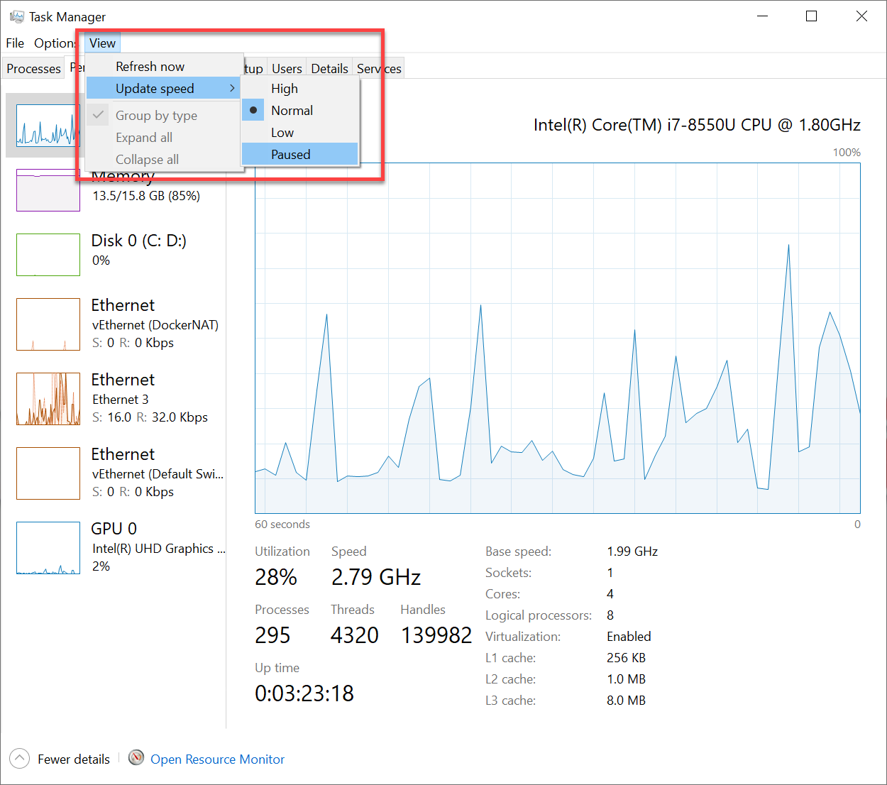
In Windows 11, open Settings in Task Manager and look for Real time update speed. Choose Normal there. The names move around between Windows builds, so look for the word Paused.
What the Percentage Means
Task Manager reports CPU as a share of every logical processor on the machine. One busy core on a 16 processor machine is a small number. A process that uses a whole core can show 6 percent, and that is normal. Read the number against the processor count before you decide a server is quiet or busy.
The Performance tab can also show one graph per logical processor. That view makes a single busy core easy to see. The overall view hides it.
Test the Graph With SQL Server
You can prove the graph is alive with a load you control. The script below keeps one scheduler busy for five seconds. It then reads the CPU time and the elapsed time of its own request. From those it works out the share of the whole machine. Run it on a test server or in a quiet moment, because it keeps one CPU busy for five seconds.
DECLARE @start datetime2(3) = SYSDATETIME(), @x bigint = 0;
WHILE DATEDIFF(MILLISECOND, @start, SYSDATETIME()) < 5000
    SET @x += 1;
SELECT r.cpu_time AS CpuMs,
       r.total_elapsed_time AS ElapsedMs,
       i.cpu_count AS LogicalCpus,
       CONVERT(decimal(5,2), 100.0 * r.cpu_time / (r.total_elapsed_time * i.cpu_count)) AS PercentOfMachine
FROM sys.dm_exec_requests AS r
CROSS JOIN sys.dm_os_sys_info AS i
WHERE r.session_id = @@SPID;| CpuMs | ElapsedMs | LogicalCpus | PercentOfMachine |
|---|---|---|---|
| 4992 | 5000 | 16 | 6.24 |
The loop used about 5,000 ms of CPU in 5,000 ms, which is one core fully busy. On a machine with 16 logical CPUs, one core is about 6.2 percent of the total. Your CPU count decides the percentage.
Run the script and watch Task Manager. In the Processes tab, find the SQL Server row. Its CPU column should rise by about that amount for five seconds, and the graph should bump. If nothing moves, the update speed is paused.
When the Two Agree
If Task Manager and the script agree, the graph is live, so a spike you see now is current. Then you can look for the cause of load in the usual places. To separate CPU pressure from other waits, read Measure CPU Pressure in SQL Server with Waits and Schedulers.
If the graph and the script disagree, trust neither until you fix the update speed. A busy server with a frozen graph looks calm, and a calm server with a frozen graph can look busy.
Is Task Manager the Right Tool?
You could argue that Task Manager is the wrong tool for a server, and that Performance Monitor records real history. For a long investigation, it is. Task Manager still earns a place for a quick glance, because it is already there and shows each process. The glance only works when the graph is moving.
What to Remember
Before you chase a CPU spike, check the Task Manager update speed. Look for a graph that does not scroll. Then run a load you control and see if the graph reacts. When someone sends you a screenshot, ask them to watch the graph for ten seconds first. A moving graph is evidence, and a frozen one is not.
The test script is bounded. It stops by itself after five seconds, and it creates nothing, so there is nothing to clean up.
A frozen graph is not a spike, it is a photograph of one.
Published by Pinal Dave on SQLAuthority. More of my work at pinaldave.com.
Discover more from SQL Authority with Pinal Dave
Subscribe to get the latest posts sent to your email.



1 Comment. Leave new
This is a good one, Pinal! We all have such a funny troubleshooting occasion, don’t we? :)