To error is human and sometimes the errors / mistakes we make can easily put our jobs at stake. Such horror stories are something I keep hearing from people and they are super cool in a way because you learn from their experiences. In a recent corridor conversation with a friend, he said how cool he found my blog on: SQL SERVER – Color Coding SQL Server Management Studio Status Bar. He personally felt this was a cool thing. But he said even after that, it is sometimes difficult because the status bar location is at the bottom. I asked what is your screen resolution – he replied (2560 x 1440).
I was pleasantly surprised because these days, the screen sizes are increasing and we are getting ridiculous resolutions making things even worse. But the solution was always around with SQL Server Management Studio. Trust me on this.
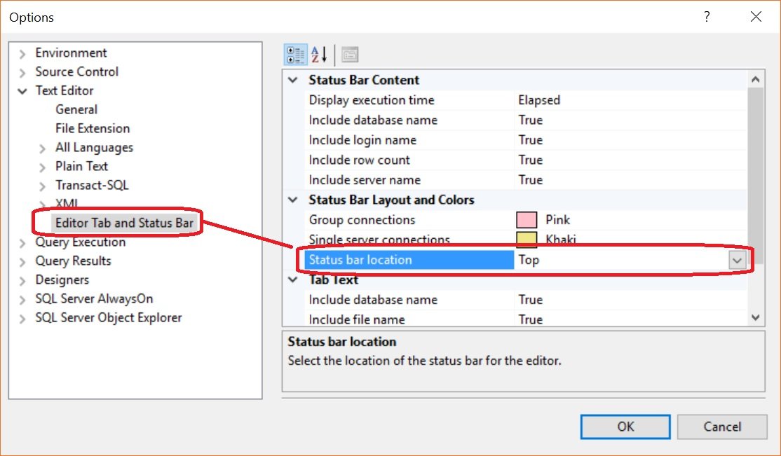
I recommended him to move his status bar from bottom to top so that it becomes easy for him and come on top of his eyeline as he is reading code. I did the below steps to show how this was easily possible.
If you hit the Tools -> Options and go to the “Text Editor” -> “Editor Tab and Status Bar”. Change the location of the “Status bar location”.

It is as easy as I have shown above. After this, press on “Ok”. Open a new query window to see the effect of the same. Your new query windows will look like below:

I found this as a cool addition that has been there for a long time but less explored. I am curious to know if you have ever used this option in your environments? How has it been useful for you? Has it saved you from making mistakes in a wrong environment? I would love to hear the stories you have with these options and settings. Let me know via the comments.
Reference: Pinal Dave (https://blog.sqlauthority.com)


7 Comments. Leave new
Yup, found it quite some time ago and have never looked back!
I have three monitors with the middle one in portrait aspect (to see as much code as possible with a minimum of scrolling – some of our code objects are hideously long) so having the status bar at the bottom puts it way away from where you normally look.
Thanks for your comment @0ddba11
great informatoin thanks.
Thanks jami.
Hi, the mentioned option in the article is very annoying to me, there is a much better, useful & less annoying feature to avoid committing unintended mistakes:
In the “Connect to Server” dialogue box – Options – Connection Properties tab – Check “Use custom color” box – then hit Select button & choose a powerful color (mine is Red) for the production servers, Green for the Testing, Dev, QA instances.
That`s why whenever I connected to a production server, the Red Status bar @ the bottom is keep on telling me: “DO NOT PLAY HERE, ALWAYS BE CAREFUL”.
This is good information. How do I adjust the columns on the status bar. SO much space telling me ‘Executing Query’, but not enough space telling me the server or other information. I want to expand the server/connection column on the status bar? Thanks